UI Rework: Disease List in Priority Screen for Treatment Rooms

Hi,
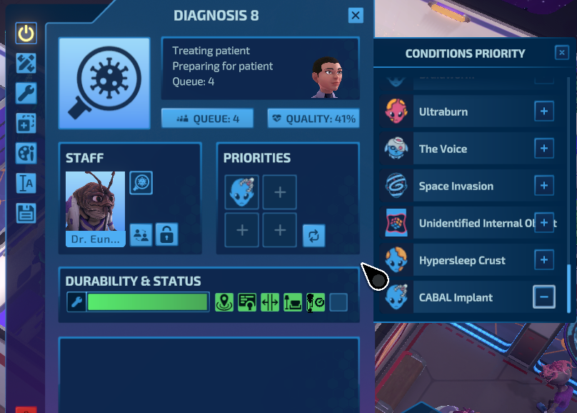
This screen on the right needs a total rework. Not just because of the overflowing text of the UIO.
There are 50 conditions by the end of the game.
This list is not populated alphabetically, it doesn't seem to be in order of appearance either, at least not when carrying over from previous missions. The CABAL implant was once in the middle, once at the end. On the Research Screen order is yet different again.
We're Sciencomagicks here, and the files aren't even in alphabetical order!? Please!
There's no textsearch either, which is vital at this point, as well as for the decorations inventory. PoE can do that, and that's not a decoration game outside of the hideouts. Though that is certainly there for the immense stash full of trash...
Further, the tiny + buttons on the right are horrible to click. Why is not the whole line a button?
With the amount of diseases, at this point it would make more sense to just have a big window with only the Icons, they tell enough. The names can be in mouse-over. Have that an alternative view. Remove the +-buttons, just give me the grid, and for the verbose name list have the entire line be the button. And alphabetical.
With that, or a grid, you could alternatively sort them by type. Not necessarily the first treatment room to go to, but whether it is physiological, psychological, neurological, parasitical. Gives some athmospheric doctorness feelings.


We're considering improvements to this UI.